
CSS 3D-Carousel
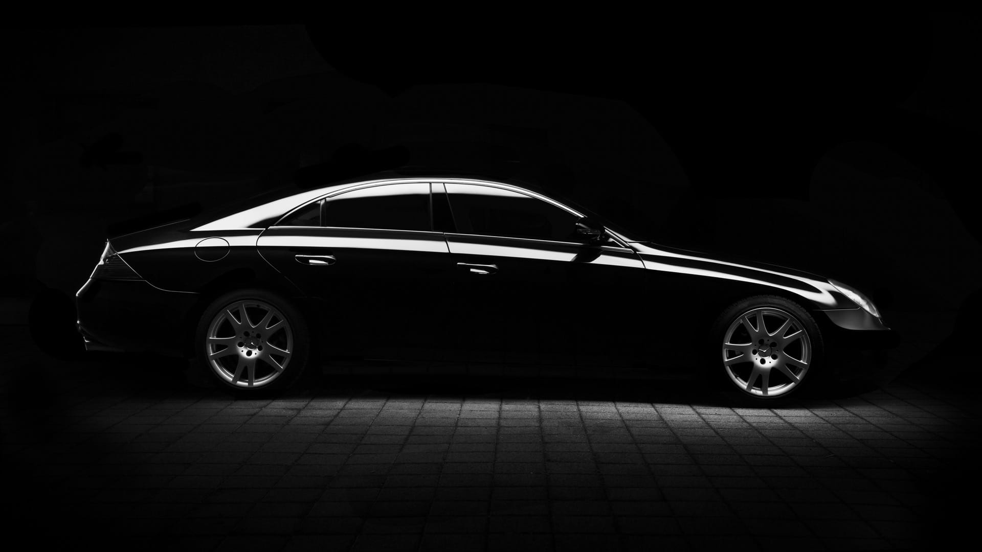
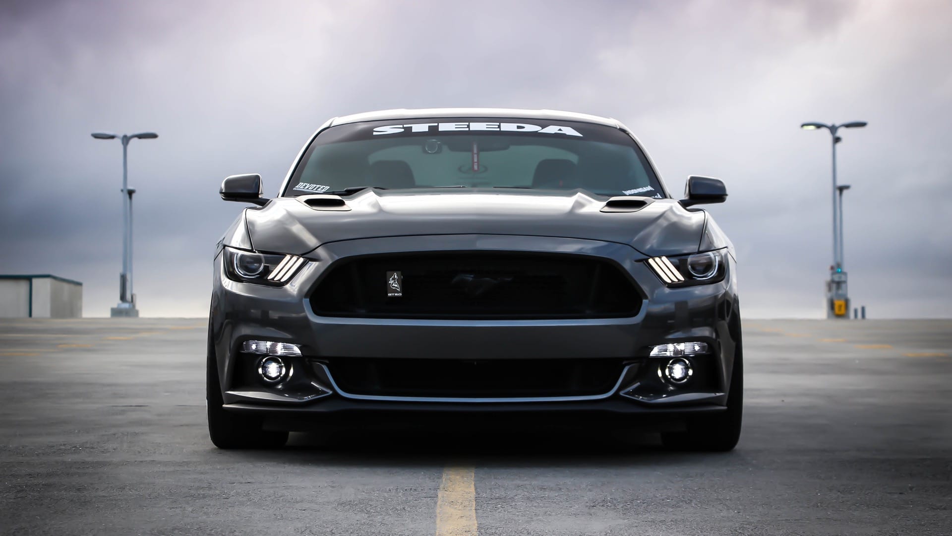
Eine etwas andere Galerie
Du möchtest deinem Besucher auf Deiner Website einen kleinen Einblick in Deine Galerie geben, aber mal auf eine andere Weise?
Dann ran ans Werk und baue Dir deine eigene 3D-Galerie.
Und so geht´s!
- Kopiere aus dem unteren Bereich den Code für das “Code-Modul”
- Erstelle eine neue Seite, eine Zeile und eine Spalte
- Wähle als Modul das “Code-Modul” und füge den zuvor kopierten Code ein
- Im Code musst Du nun die Links zu deinen Bildern einfügen. Den Link zu einem Bild findest Du in deinen Medien, klicke auf ein Bild und oben rechts wird der Link angezeigt.
- Speichern und weiter geht es mit dem Benutzerdefinierten CSS-Code
- Kopiere aus der Seite den Code für die “Benutzerdefinierte CSS” und füge ihn in deine Seite ins Benutzerdefinierten-CSS der Seite
- Speichern und deine Galerie sollte im 3D-Lock erscheinen
Viel Spaß!
3D Carousel mit CSS






Code-Modul
<section class ="slideshow">
  <div class="content">
  <div class ="content-carrousel">
    <figure class ="shadow"><img src ="DEIN-BILD-1.jpg"></figure>
    <figure class ="shadow"><img src ="DEIN-BILD-2.jpg"></figure>
    <figure class ="shadow"><img src ="DEIN-BILD-3.jpg"></figure>
    <figure class ="shadow"><img src ="DEIN-BILD-4.jpg"></figure>
    <figure class ="shadow"><img src ="DEIN-BILD-5.jpg"></figure>
    <figure class ="shadow"><img src ="DEIN-BILD-6.jpg"></figure>
    <figure class ="shadow"><img src ="DEIN-BILD-7.jpg"></figure>
    <figure class ="shadow"><img src ="DEIN-BILD-8.jpg"></figure>
    <figure class ="shadow"><img src ="DEIN-BILD-9.jpg"></figure>
  </div>
</div>
</section>
Benutzerdefinierte CSS
/* Benutzerdevinierte-CSS-3D-Carousel */
.slideshow{
  margin:0 auto;
  padding-top:50px;
  height:400px;
  background:rgba(255,255,255,0);
  box-sizing:border-box;
}
.content{
	margin:auto;
  width:190px;
  perspective:1000px;
  position:relative;
  padding-top:80px;
}
.content-carrousel{
  width:100%;
  position:absolute;
  float:right;
  animation:rotar 15s infinite linear;
  transform-style:preserve-3d;
}
.content-carrousel:hover{
  animation-play-state:paused;
  cursor:pointer;
}
.content-carrousel figure{
	width:100%;
  height:120px;
  border:1px solid #4d444d;
  overflow:hidden;
  position:absolute;
}
.content-carrousel figure:nth-child(1){
  transform:rotateY(0deg) translateZ(300px) ;
}
.content-carrousel figure:nth-child(2){
  transform:rotateY(40deg) translateZ(300px) ;
}
.content-carrousel figure:nth-child(3){
  transform:rotateY(80deg) translateZ(300px) ;
}
.content-carrousel figure:nth-child(4){
  transform:rotateY(120deg) translateZ(300px) ;
}
.content-carrousel figure:nth-child(5){
  transform:rotateY(160deg) translateZ(300px) ;
}
.content-carrousel figure:nth-child(6){
  transform:rotateY(200deg) translateZ(300px) ;
}
.content-carrousel figure:nth-child(7){
  transform:rotateY(240deg) translateZ(300px) ;
}
.content-carrousel figure:nth-child(8){
  transform:rotateY(280deg) translateZ(300px) ;
}
.content-carrousel figure:nth-child(9){
  transform:rotateY(320deg) translateZ(300px) ;
}
.shadow{
  position:absolute;
  box-shadow: 0px 0px 20px 0px #000;
}
.content-carrousel img{
  image-rendering: auto;
  transition: all 300ms;
  width:100%;
  height:100%;
}
.content-carrousel img:hover{
  transform:scale(1.2);
  transition:all 300ms;
}
@keyframes rotar{
  from{
    transform:rotateY(0deg);
  }	to{
    	transform:rotateY(360deg);
	}
}